Legibility
It is very important that work for an audience is presented clearly in a way that allows an audience to understand the message behind it. The typeface needs to be legible and be of a good size for its format. For example a billboard poster would not want a size 14 font as no one would be able to read it. If a font is overly fancy and decorative it may make it hard to read or put people of especially if it used in a context where what is said is intended to be taken seriously. The colour of the font also needs to be considered. It is important to make an impact with the font but it also needs to legible - a light font on a light background could make it difficult to read.
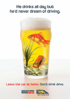
This campaign, 'drinking like a fish' is a clear message, 'Don't drink and drive.'
The font is clear and simple, there is not too much writing and the typeface is of an appropriate size. The line 'Leave the car at home' is in red which makes it stand out and gives a serious tone. The image is very eye catching and reinforces the message. Unlike a number of other drink drive campaigns this image is not as sinister. It is slightly different and is more likely to catch the attention of a younger audience who may try to ignore some of the more sinister adverts which can come across as very frightening.
It is not an image that is entirely obvious at first. The audience have to stop and look to thoroughly understand the meaning and as a result it is an effective piece of visual communication.
Everything is aligned well and the layout draws your eye down the page, until the company logos at the bottom. The fact that everything is seen within the whole poster shows that it has succeeded in giving the message.
Bibliography
Tone of Voice
Tone of Voice within a piece can help specify an audience. Words and images can be given a tone of voice. Something can be made serious or gender specific in the way that it is presented.
Here is a well known clear sign that has a definite tone of voice. The word 'stop' is in capitals and a large clear font. The tone of voice in this sign is very serious and gives the impression that whoever is going towards this sign must stop without fail. The red background reinforces this, giving an authoritative tone.
This is just a simple example of the way that tone of voice can be used.
Company's also adopt a tone of voice, to give them a particular audience. This is the image that has become the face of the company, Sheila's Wheels.
Sheila's Wheels is a car insurance company that is clearly aimed at women. The colour choices obviously are meant to appeal to women. It is a fun image, the way it has been presented is not meant to be serious, it is overly glamorous and girly and supposed to be funny. The font used is also designed to tie in with this theme. The company has recognised that car insurance can seem dull and uninteresting and to remedy this they have created a tone to make it more exciting.
Biography
www.sheilaswheels.com


No comments:
Post a Comment